Tone Dropping in Photoshop in 7 easy steps
 Someone asked me how I do the tone dropping on images… That effect where you have just one primary colour showing whilst the rest of the image is black and white.
Well here is the simple way I have found to do it.
This is done using Photoshop CS4 (Win Version) (but the principal is the same for all graphic editing software, just the keystrokes are different)
There are two main ways of doing this tone dropping effect. The easy way for a single object is simply to duplicate the image three times (always have a backup layer) Then de saturate the middle layer, that is make it black and white. The shortcut for this is CTRL+SHIFT+U. Or if you want fine control… then you go to the Image Tool Bar (Alt I), Adjustments, then Choose Black and White (or just ALT+SHIFT+CTRL+B) . I tend to only do the quick desaturation option 🙂
Once you have this black and white layer and you have a simple area you wish to keep in colour… you erase the top layer leaving only the single colour area. This will only work it you are doing something really simple. More complicated colour and shapes… is what I am really talking about…
So here goes.
Step 0. – Choose an Image
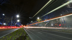
You are looking for an image that has a striking colour in it. When taking the shot, you might even want to look for a colour that will stand out and ensure that you capture as much (or as little) as you want. The image I have chosen to show you is based around a long exposure of car and tram rear lights. But you will see on my Selective Colouring Flickr set that I use lots of different objects and colours.
Step 1. – Import your Image
This is the image as it appears imported from the NEF file from my Nikon D90 into Camera Raw. Here you can tweak all the exposure and vibrancy settings, it also helps to give a slight nudge to the Saturation, just to help bring out some of the primary colours.

Step 2. – Make some layers to play with.
 Now in the layers palette make a duplicate of the background (drag the background onto the new layer icon, next to the trash). This way you have a nice original layer to return to if you make a mistake and don’t want to reimport everything.
Step 3. – Get the Colour.
In this image I am after the red. Remember primary colours are the easiest to work with and make for the strongest images as well. You can of course use the colour selection tool to choose a different colour, but oh that gets tedious.
To bring up the Colour Selector… Choose Select from the Menu Bar (ALT-S) then Colour Range.
It will default to Sampled Colours. Click on that to bring up the following menu.

In this case we are after the reds… so choose red. You will then see a sample of the selection on the preview window. At this point you may get a screen that says.
” Warning: No pxiels are more than 50% selected. The selection edges will not be visible.”
All this means is that you will not see the marque on the screen showing you a selection.
Step 4. – Processing the Selection.

You will see in this screen grab that the marque lines are showing. But like the warning dialogue box you might get… not all of the red is showing as selected. Don’t panic it is… Now do a copy of the marque CTRL+C to store it.
Step 5 – Making the Red and the Black and white.
Now we have a copy of only our red channel in the clipboard. We need to put it into a new layer. Either select the new layer command in the layer window or just press CTRL+SHIFT+N to create this layer.
 Once the layer is created, simple Paste (CTRL+V) the colour layer into the new Layer 1. Now you have a in this case Red only channel to play with.
Now we take the Background Copy Layer, select that and Desaturate it. Either via the CTRL_SHIFT+U or the ALT+SHIFT+CTRL+B methods.
Hey presto you have a rough cut to work with.
Step 6 – Not Strong Enough?
 Perhaps at this point you are thinking that really it is all wishy washy and not worth the effort so far. Yes you are right. Often at this point the colour is not that intense. The easy fix at this point is to duplicate the colour layer one or two times (sometimes more) until you get the desired strength of the output you are after. In this case it was only two layers.
Step 7 – The Final Touches.
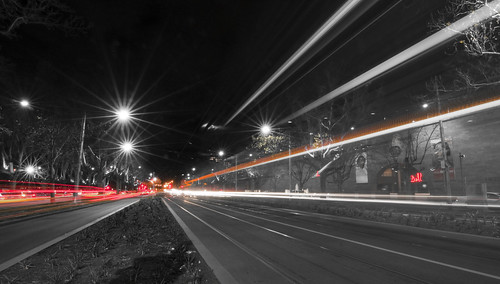
 Now this image was easy. Here you can see the isolated red layer and the placement of colour across the image. But say there was a red light at the top of the image, that you really didn’t need. On this layer (making sure you merge down all your duplicates if you have created them) you get the eraser tool and delete the areas of colour you don’t want. If I was being really fussy I could have deleted a few spots of red around the place just to clean the image up. (another tip… before you start erasing stuff, duplicate this final colour layer, turn it off… that way you don’t have to worry about the history buffer going to far when doing fine erasing)
And here is the final image…
Technical Data on the Shot.
 Camera: Nikon D90
Exposure: 20seconds
Aperture: f/22.0
Focal Length: 11 mm
ISO Speed: 200
Flash: No Flash
Orientation: Horizontal (normal)
Software: Adobe Photoshop CS4 Windows
Exposure Program: Manual
Date and Time (Original): 2009:09:01 18:50:24.00+10:00
Max Aperture Value: 2.8
Exposure Mode: Manual
White Balance: Auto
Focal Length In35mm Format: 16 mm
Lens: Tokina AT-X 116 Pro DX – 11.0-16.0 mm f/2.8
White Balance: As Shot
Remember in the digital world… if you make a mistake it doesn’t matter… you can just start again… So go out take photos and play.


